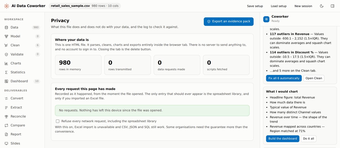
The app’s own log, after a full analysis of a 980-row client file. 0 rows transmitted. 0 requests made. You do not have to take our word for it — the evidence is inside the app, and you can export it.
For accountants and bookkeepers
VISSTA is an AI data coworker that opens a spreadsheet, cleans it, charts it and writes it up — entirely inside your own browser tab. Nothing is uploaded. There is no copy of your client’s data on our server, because there is nowhere for it to go. The analysis needs no network at all: unplug halfway through and it carries on working.
One click cleans the file, builds the dashboard, writes the report and makes the slides. Want it different? Just say so — the coworker changes it. Nothing to learn, and nothing to upload.
Start free — no card needed See the proof
The app’s own log, after a full analysis of a 980-row client file. 0 rows transmitted. 0 requests made. You do not have to take our word for it — the evidence is inside the app, and you can export it.
Every other tool asks you to upload the file first. That is the part you cannot do.
You do not have to tell a client that their payroll, their ledger or their patient list went to a company they have never heard of — because it did not. The file is read by your browser, on your machine, and closing the tab deletes it.
There is no sub-processor to disclose and no data-processing agreement to negotiate over a spreadsheet, because we never receive the spreadsheet. The only things our server ever holds are your email address, your plan and your payments.
The app logs every network request it makes from the moment your file opens, and counts rows in memory against rows transmitted. The second number is zero. There is a switch to refuse network access outright, and an evidence pack you can export and put in the file.
Cleaning, charts, statistics, the report, the deck and the coworker itself all run on your own machine. No model in a data centre, no queue, no outage — and no round trip carrying your client’s numbers.
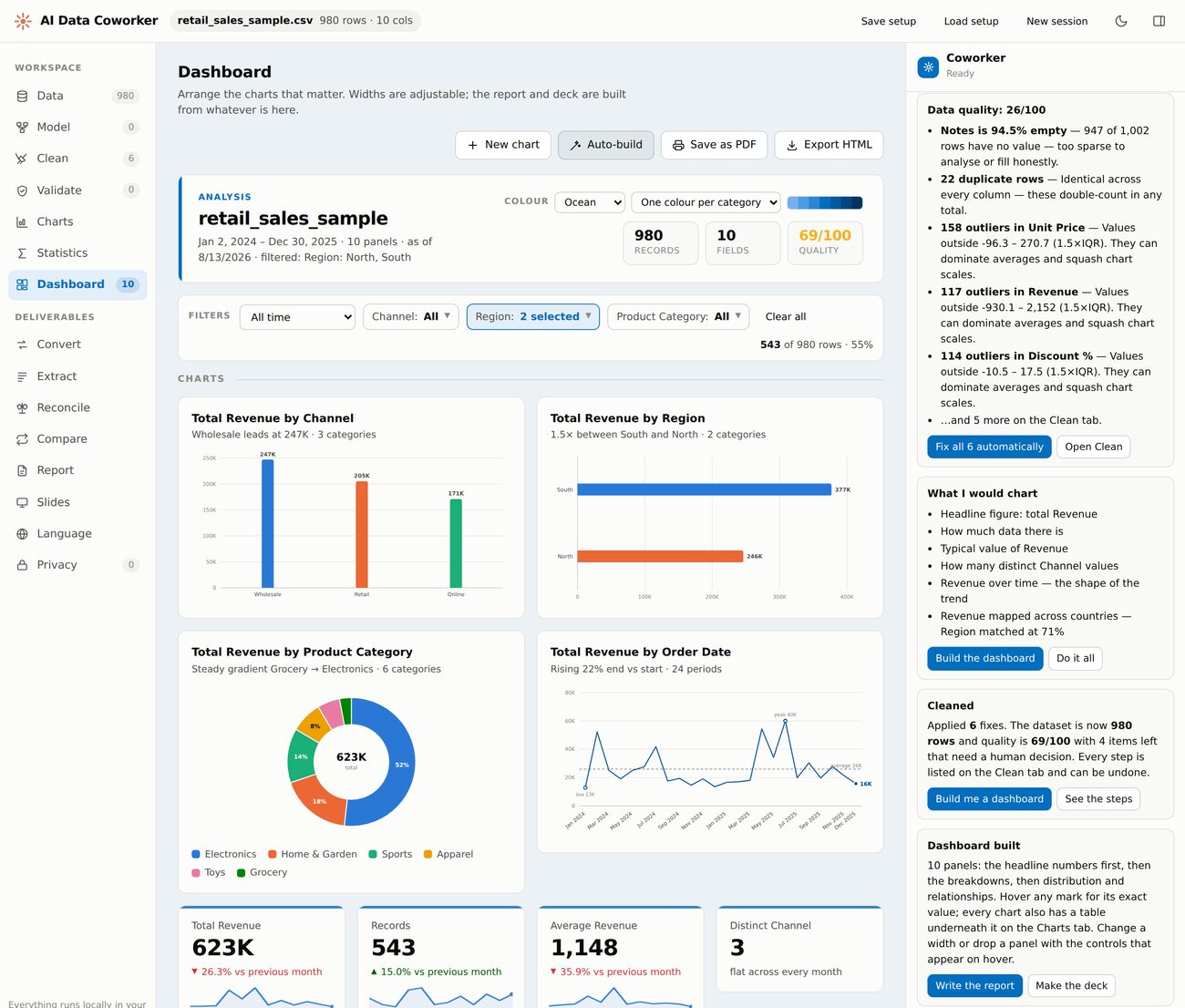
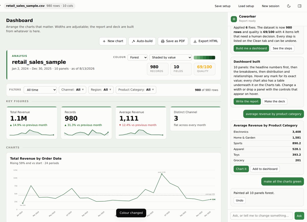
Ten panels from a 980-row sales file, in one click — and one filter narrowing all of them at once. None of it left the machine it was made on.
Four things happen. You do almost none of them.
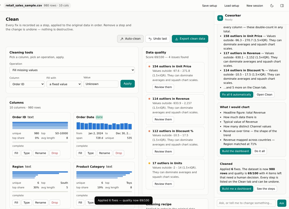
Duplicate rows, blank cells, outliers, stray spaces, columns that are text when they should be numbers. The coworker finds them, tells you plainly what it found, and fixes them when you say go. Every step is listed, and every step can be undone.
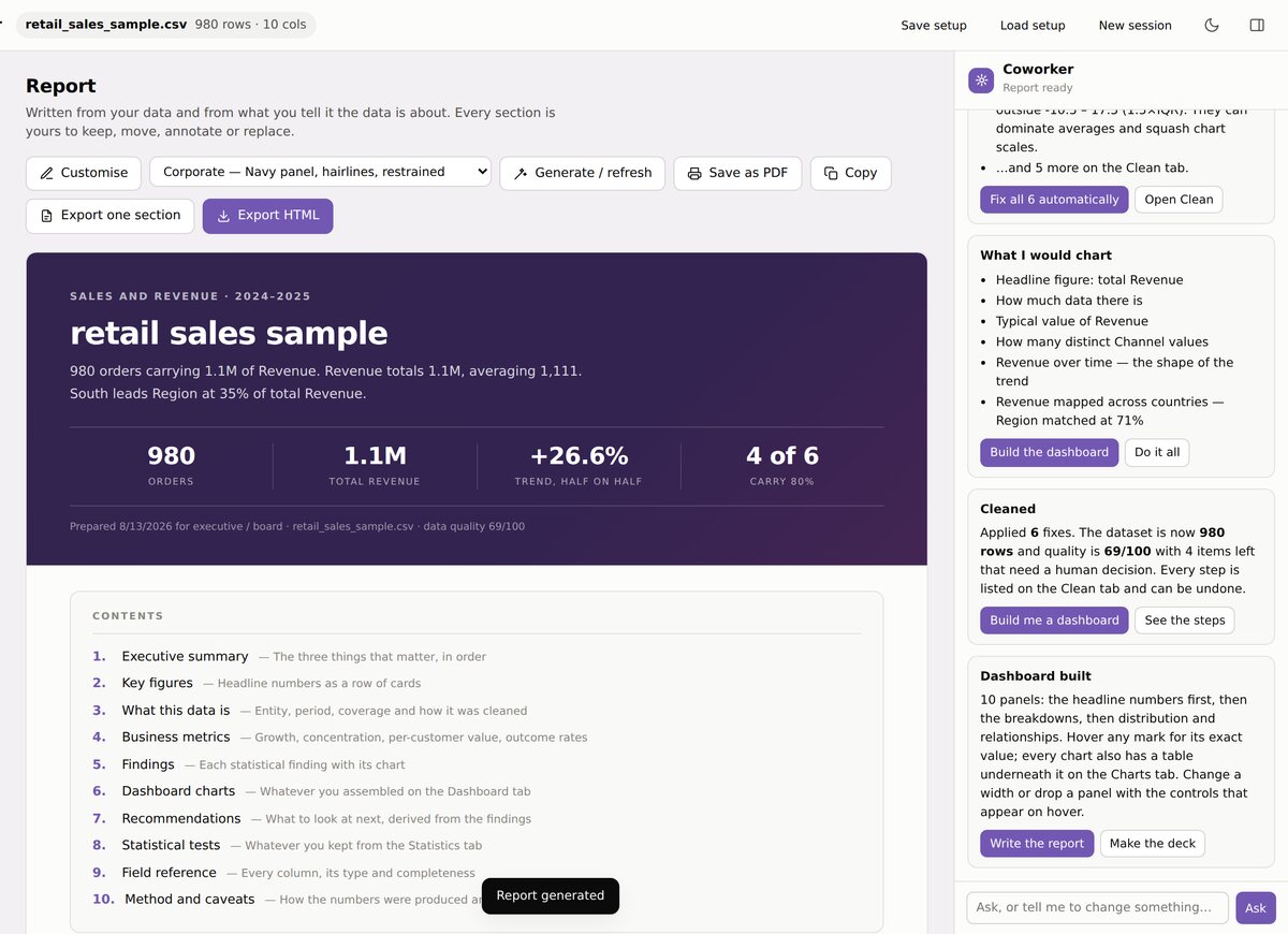
The dashboard, a written report and a real PowerPoint deck — all from the same numbers, so they never disagree with each other. You are not dragging fields into boxes or picking chart types. You press one button.
“Average revenue by product category.” “Which sales rep sold the most?” “Make slide 3 a bar chart.” Type it the way you would say it to a colleague, and the coworker does it. That is the whole interface.
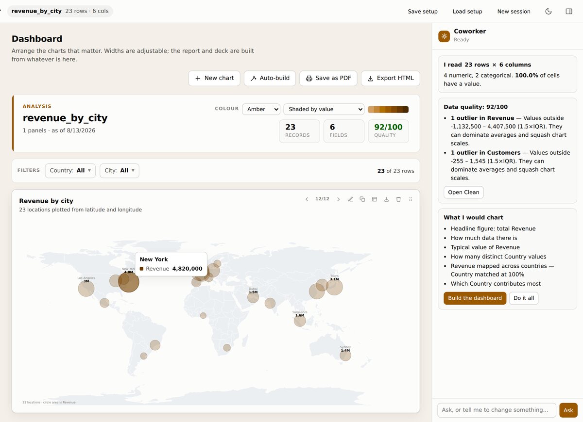
Give it places and it maps them — a circle at each city sized by the number, or whole countries and US states shaded by value. Either way it writes the name and the figure onto the map, and hovering any mark gives you the exact value. A map you have to squint at and convert shades back into numbers is a picture. This is an answer.
Also included: 19 chart types, statistical tests with plain-English verdicts instead of a wall of numbers, import from Excel, CSV, JSON and SQL dumps, and translation of everything into seven languages.
VISSTA is one HTML page. Your file is read by the browser and analysed there, in memory. There is no upload step to opt out of and no storage bucket with your name on it — the server that runs this website has never been sent a row of anyone's data, and could not produce one if it were asked to.
What the server does hold: your email address, which plan you are on, and what you have paid. That is the whole list.
Start free. Upgrade only if you need to. Cancel any time.
Prices are in US dollars and exclude any tax that may apply where you live. Payments are processed by Stripe; we never see or store your card details. Subscriptions renew automatically — monthly or fortnightly, depending on the plan — until you cancel.
Fifteen jobs that normally need four different programs and someone who knows what a pivot table is. Each one is a tab down the left-hand side of the app.
Getting your data in
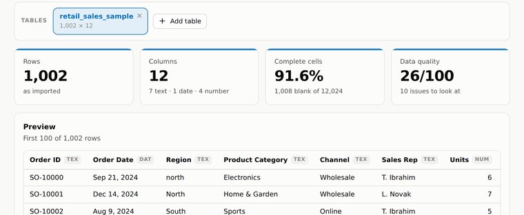
CSV, TSV, TXT, Excel, JSON, JSON Lines, XML and SQL dumps. Or copy cells straight out of Excel or Google Sheets and paste them in. It reads the file and tells you what it found — how many rows, which columns are dates, which are numbers, and how much is missing.Try it: 1,002 rows, 12 columns, 91.6% of cells filled — read in about a second.
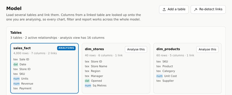
Load a sales file, a product list and a store list, and it works out how they join up — then treats them as one. You can chart revenue by store manager even though revenue and manager live in different files. A SQL dump with twelve tables in it comes in as twelve tables.It measures how well the tables actually match, rather than assuming.
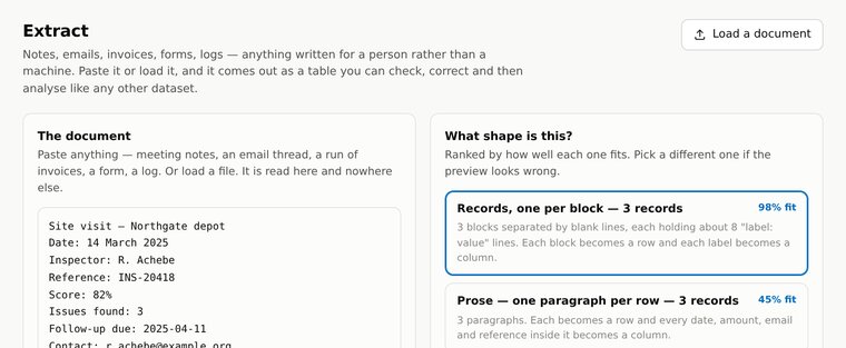
Meeting notes, emails, invoices, forms, logs — anything written for a person rather than a machine. Paste it in and it works out the shape, pulls out the names, dates, amounts, references and email addresses, and hands you a table you can check and correct.It shows you how confident it is, and lets you pick a different reading.
Converting and cleaning
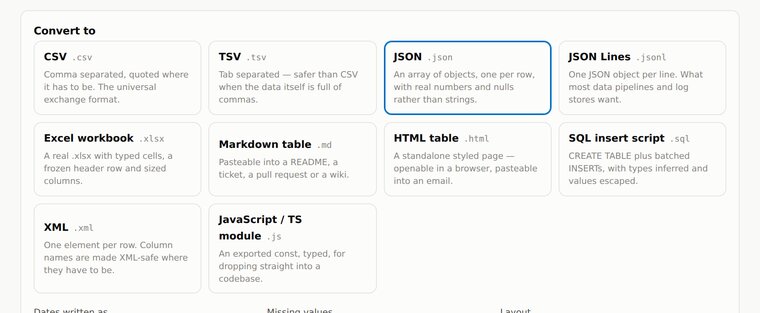
Ten output formats: CSV, TSV, JSON, JSON Lines, Excel, Markdown, HTML, SQL insert script, XML and a JavaScript module. Drop files in and convert them in a batch. Dates stay dates, blanks stay blank, and quoting is handled properly — which is where free converter websites usually fall over.None of it is uploaded. The conversion happens on your own machine.
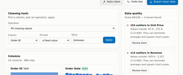
It finds duplicate rows, blank cells, outliers, stray spaces, inconsistent capitalisation and columns stored as text that should be numbers or dates. It says what it found in plain words, fixes them when you say go, and lists every step so you can undo any of them.Nothing is destroyed — every fix is a step applied to the original.
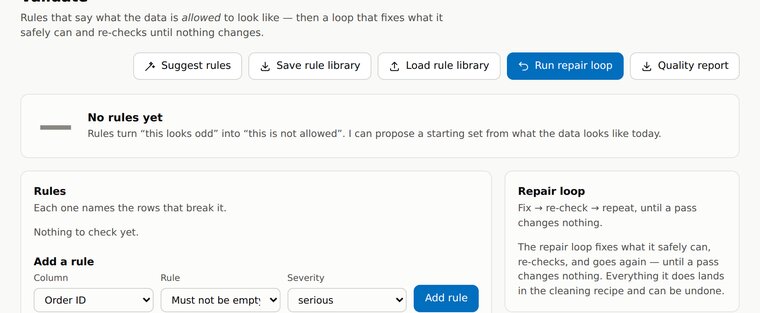
Rules that say what the data is allowed to look like — this column can never be empty, that one must be a positive number, these two must agree. It can propose a starting set by looking at your data, then fix, re-check and repeat until nothing changes.Save the rules and apply them to next month’s file.
Checking it against something else
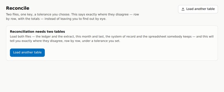
The ledger and the bank export. This month and last month. The system of record and the spreadsheet somebody keeps on their desktop. Give it both, tell it which column is the key and how much difference you will tolerate, and it says exactly where they disagree, row by row.
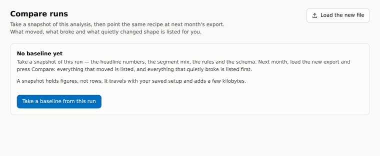
Take a snapshot of an analysis, then point the same recipe at next month’s export. It tells you what moved, what broke, and what quietly changed shape when nobody was looking — new columns, missing ones, figures that shifted more than they should.
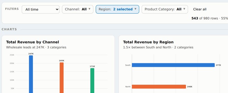
Pick a region, a date range, a product line — and every chart, the report and the deck all narrow to it together. No re-running anything. The bar tells you exactly how much of the data you are looking at, so nobody presents a number without knowing it was a slice.Two regions chosen: 543 of 980 rows · 55%. Clear all puts it back.
Understanding it
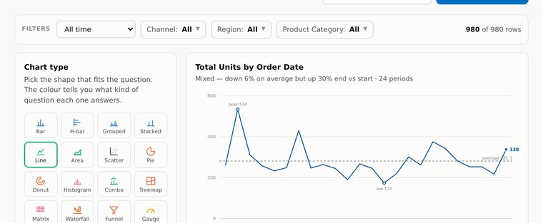
Bar, horizontal bar, grouped, stacked, line, area, scatter, pie, donut, histogram, treemap, heatmap, waterfall, funnel, gauge, combo, maps, tables and single big numbers. Pick one, or let it propose the whole dashboard from what your data actually contains.Every chart has the numbers behind it in a table underneath.
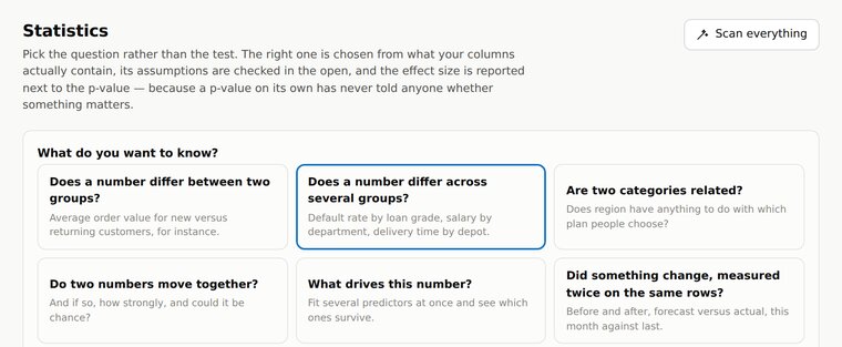
It asks what you want to know — does a number differ between two groups?, do two numbers move together?, did something change? — and picks the right test for you. The assumptions are checked in the open and the answer comes in a sentence, not a table of Greek letters.T-tests, ANOVA, chi-square, correlation, regression and non-parametric tests.
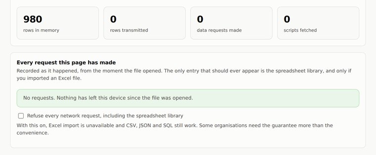
The privacy panel logs every network request the page has made since you opened your file, and counts the rows sitting in memory against the rows transmitted. The second number is zero. You do not have to take our word for any of this — the evidence is in the app.You can even switch off network access entirely and keep working.
Getting it out again
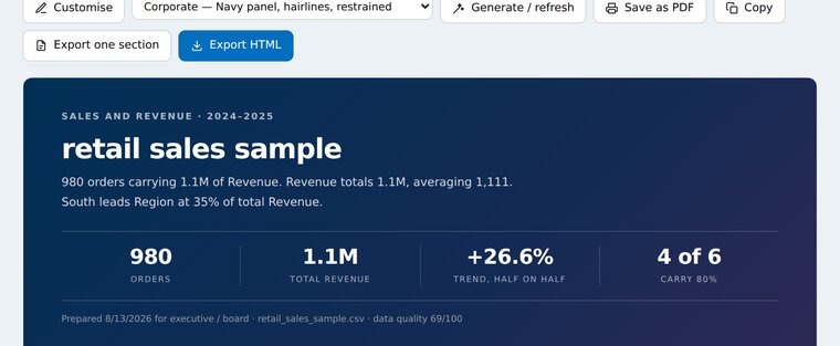
Executive summary, key figures, what the data is, business metrics, findings with their charts, recommendations, statistical tests, a field reference and the method. Every number in the prose is the same number as in the charts. Four house styles, and every section is yours to move, edit or delete.Export as HTML or PDF, or copy it into Word with the formatting intact.
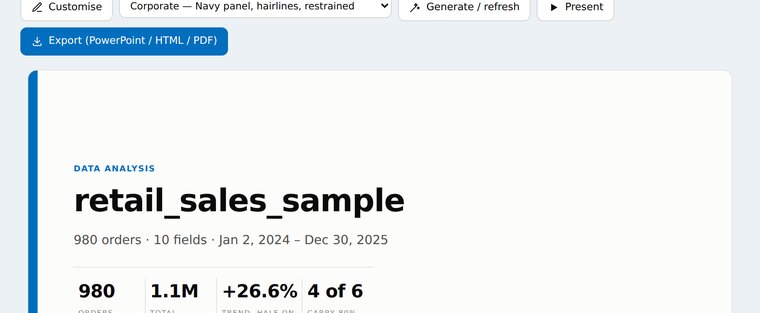
Not a picture of slides — an actual .pptx with editable text boxes, which opens in PowerPoint or Keynote and can be reworked like anything you made yourself. Present it full screen from the browser, or export it as HTML or PDF instead.Say “make slide 3 a bar chart” and it does it.
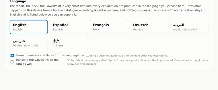
Spanish, French, German, Arabic, Persian and Chinese, as well as English. The report, the deck, every chart title and every explanation come out in the language you choose — with right-to-left layout for Arabic and Persian, and numbers and dates formatted the way that language writes them.The translation happens on your machine. Nothing is sent away to be translated.
Short pages, no lawyers' fog. Worth two minutes before you pay for anything.
Cancel any time. Full refund within 14 days of a monthly payment, no questions asked.
What we provide, what you are responsible for, and how either of us can end it.
Your email, your plan, your payments. Never the contents of your files.
A real person answers, usually within one business day.